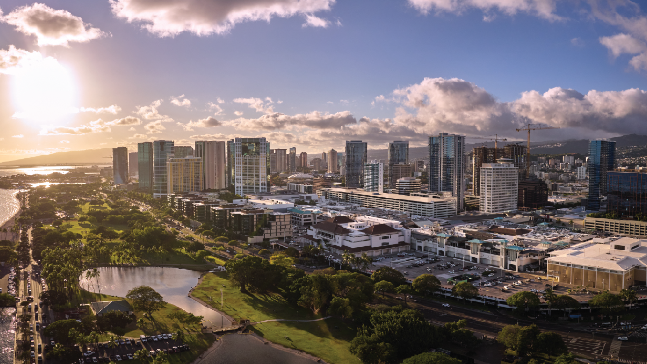
Case Study 03 — Brand Identity · Guidelines · Print · Illustration
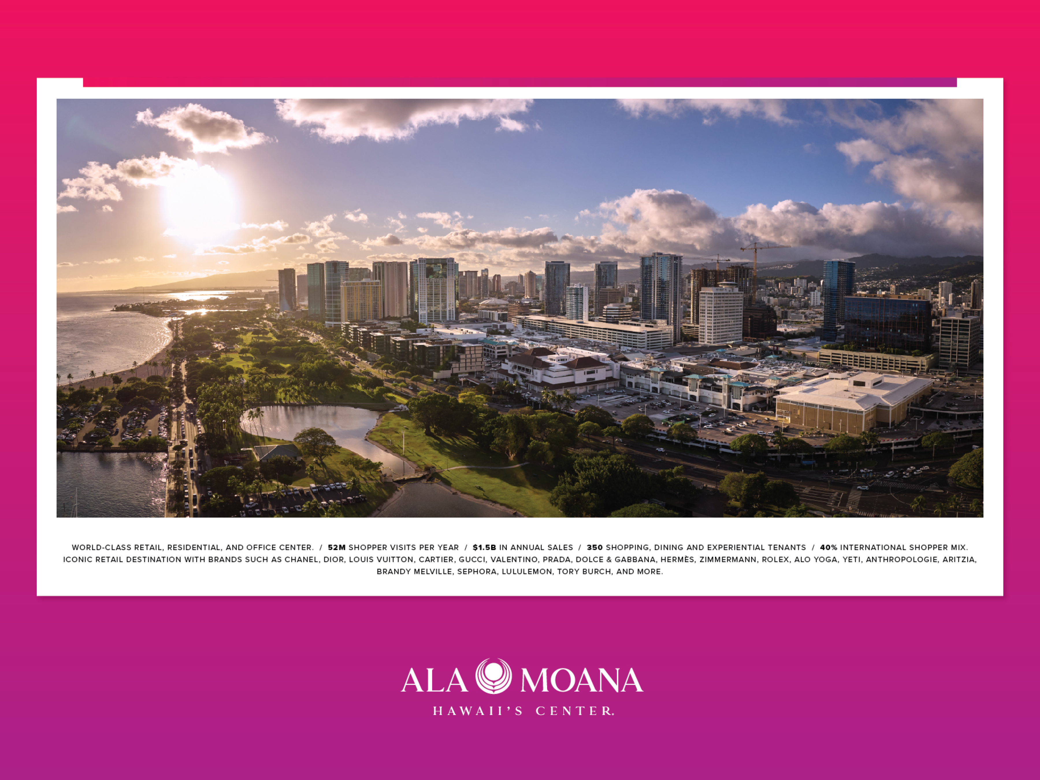
Ala Moana Center — the world's largest open-air shopping mall with over 350 tenants and $1.5B in annual sales — needed a brand identity refresh. The goal was to reposition the property simultaneously as a world-class luxury retail destination, a Pacific cultural hub, and a premier tourism experience that resonated equally with local Hawaiian communities and international visitors.
The brand system needed to work across every touchpoint — digital, print, OOH, signage, leasing materials, and in-mall environmental graphics — while honoring the cultural complexity of its Pacific location.
I contributed to the brand system development, gave art direction, designed the guidelines layout, and produced the final brand guidelines document — including the color system, typography standards, key art direction, and all advertising mock executions across print, OOH, and digital formats.
The scope extended beyond the guidelines document to include the official Ala Moana Center retail directory for the leasing team — a five-level, full-color architectural floor plan mapping 350+ tenants across all levels of the mall, each floor color-coded using the brand palette.
The brand system I helped build continues to define Ala Moana Center's visual identity across all digital and physical touchpoints, including the live website at alamoanacenter.com.

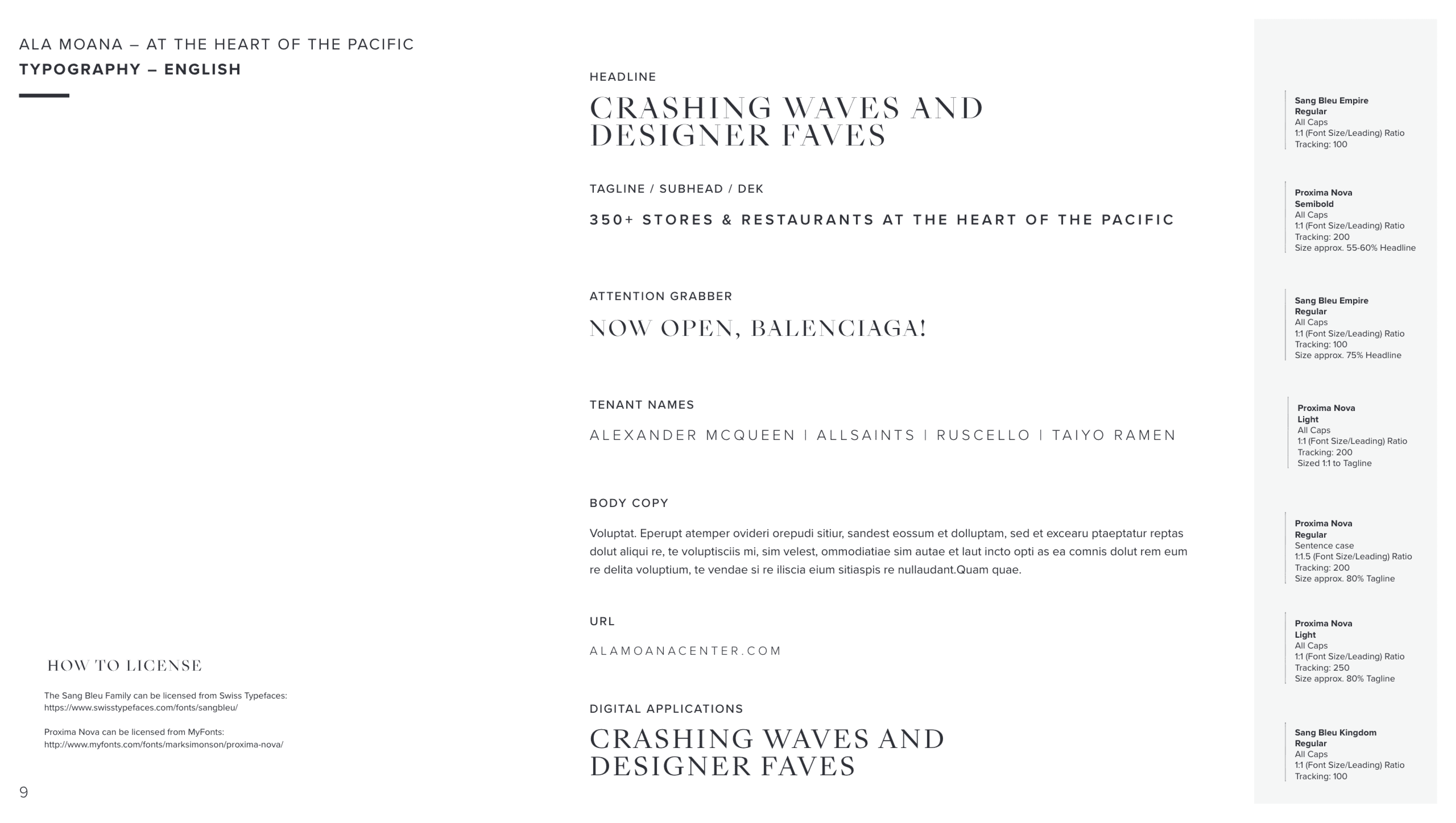
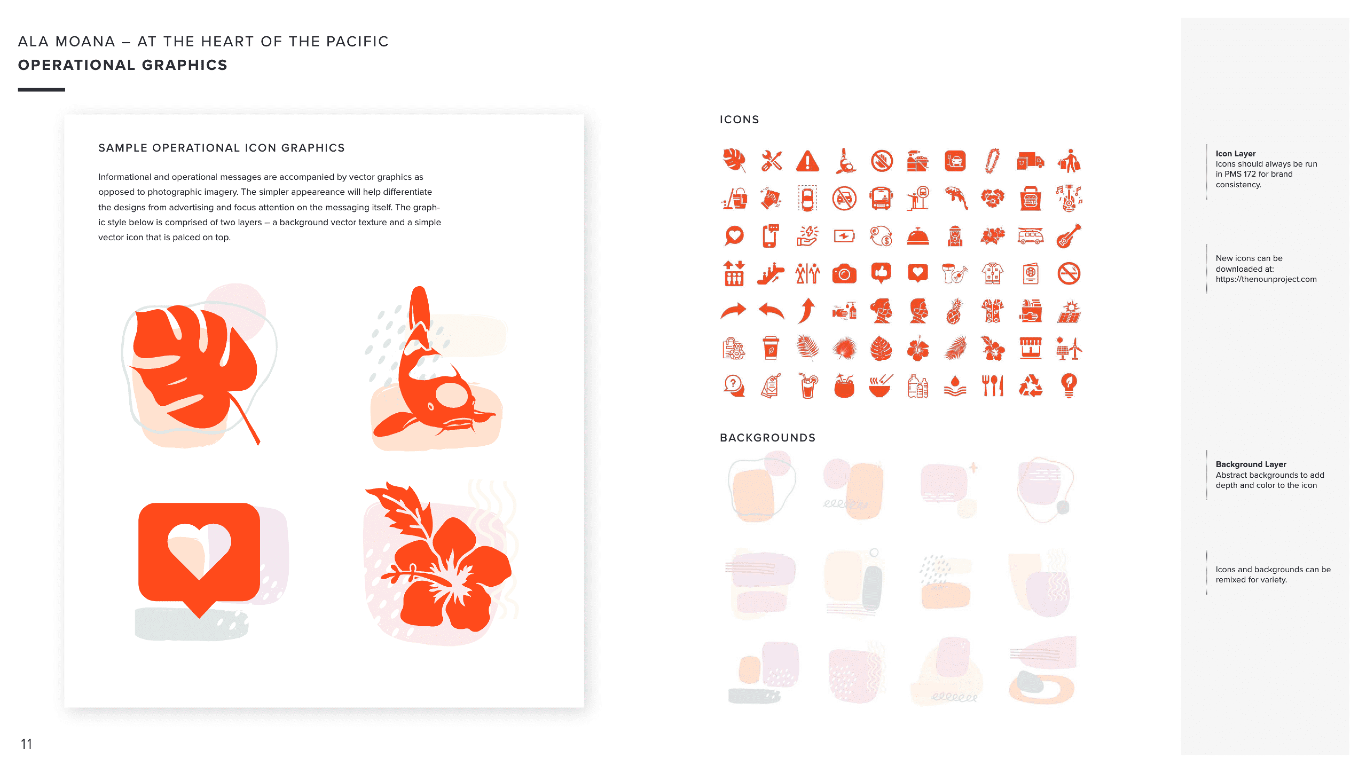
Color system · Typography — Sang Bleu Empire + Proxima Nova · Operational icon graphics
Ala Moana sits at a genuine cultural crossroads — Hawaii's largest mall attracts 52M shoppers annually with a 40% international mix, primarily from Japan, China, and Korea. Designing a brand that felt equally authentic to local Hawaiian culture, Western retail sensibilities, and Asian visitor expectations required deep intentionality at every level.
Color carries specific cultural meaning in Asian markets that doesn't translate directly to Western contexts. Every palette decision had to work across all audiences without inadvertently signaling the wrong message to any of them.
The brand identity was built around the concept of "At the Heart of the Pacific" — positioning Ala Moana not just as a mall but as a cultural destination at the meeting point of East and West. The kaleidoscope key art system translated Hawaii's natural world — ocean, flora, koi, landscape — into bold, symmetrical patterns that resonated across cultural contexts.
The color system was anchored by Rubine Red with a Pacific-inspired secondary palette of teal, purple, and orange — each chosen for cross-cultural legibility and brand differentiation in both luxury retail and tourism contexts.
Every creative decision on this project had to account for a dual audience — the local Hawaiian community and an international visitor base that was majority Asian. This level of cultural sensitivity in brand design is rare and required genuine strategic thinking beyond aesthetics.
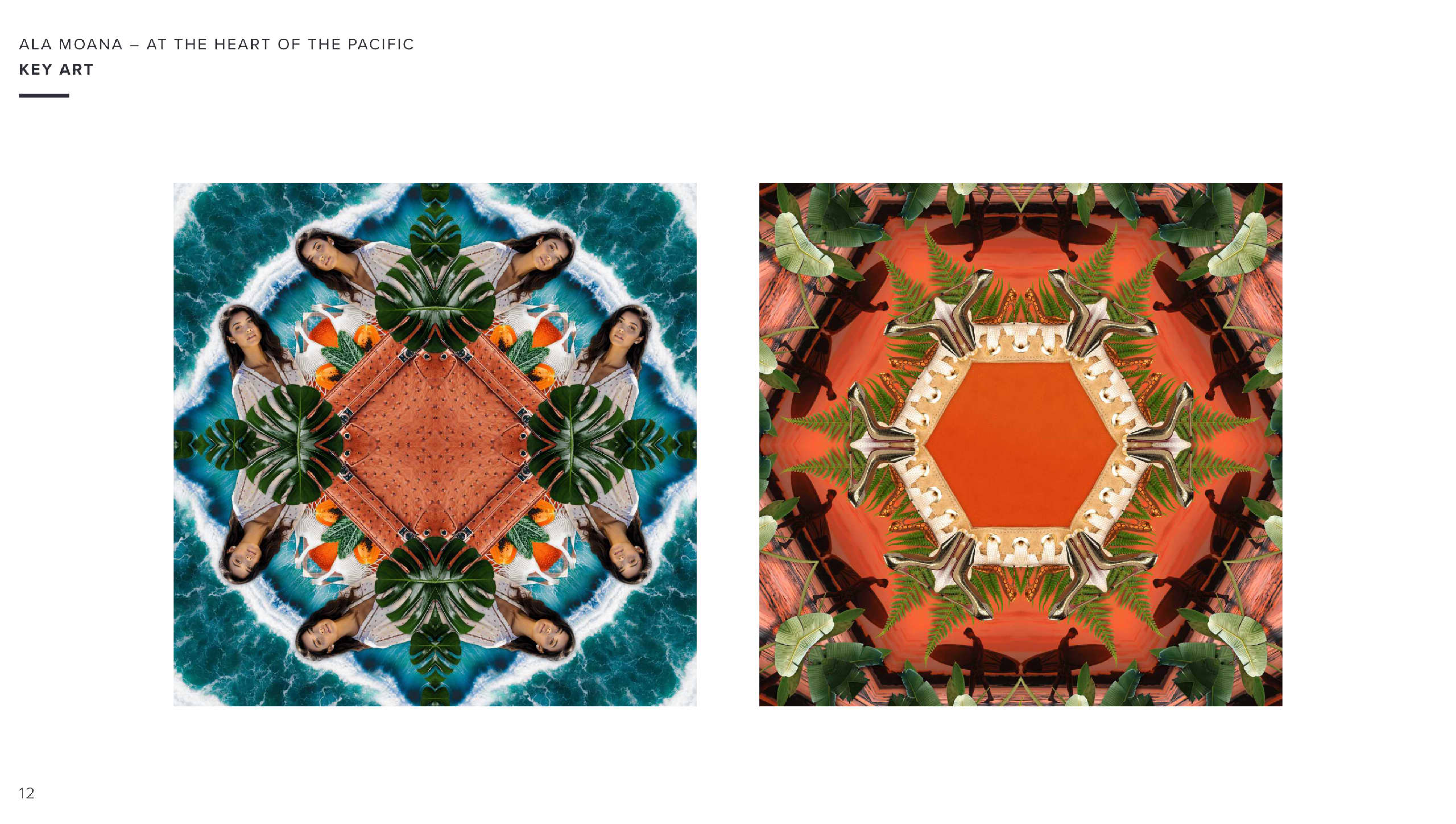
Kaleidoscope key art system — Hawaii's natural world abstracted into bold symmetrical patterns
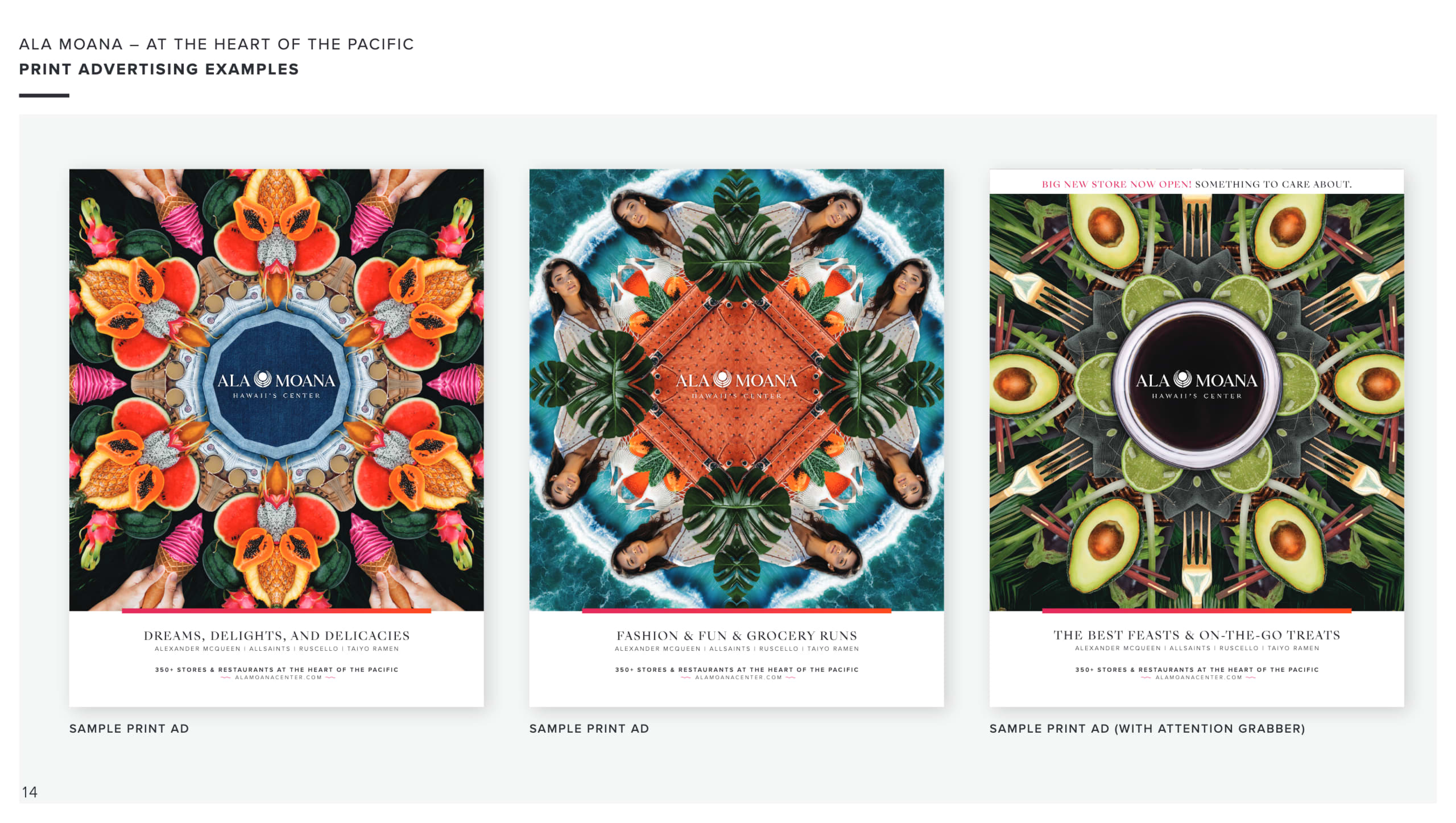
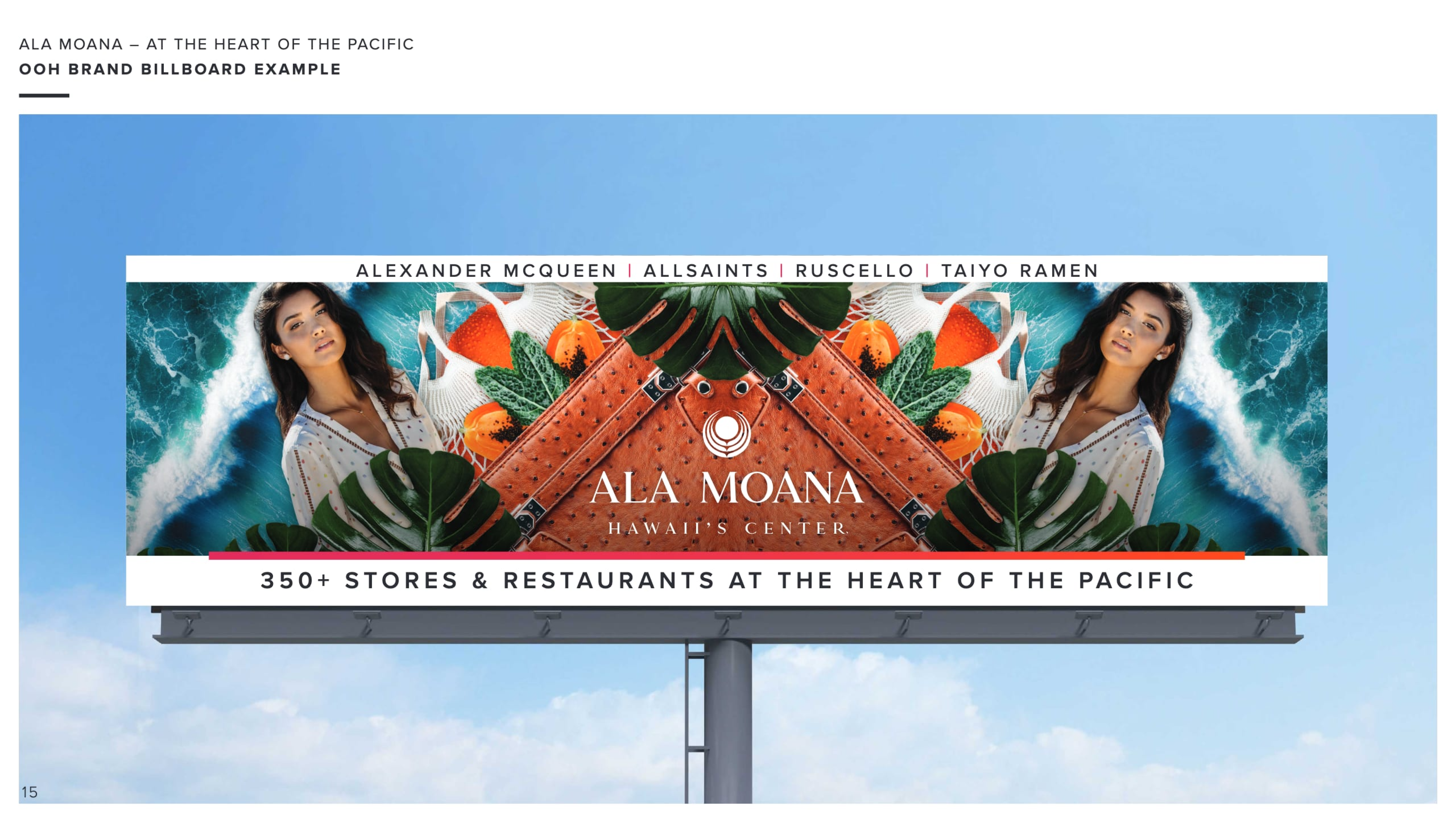
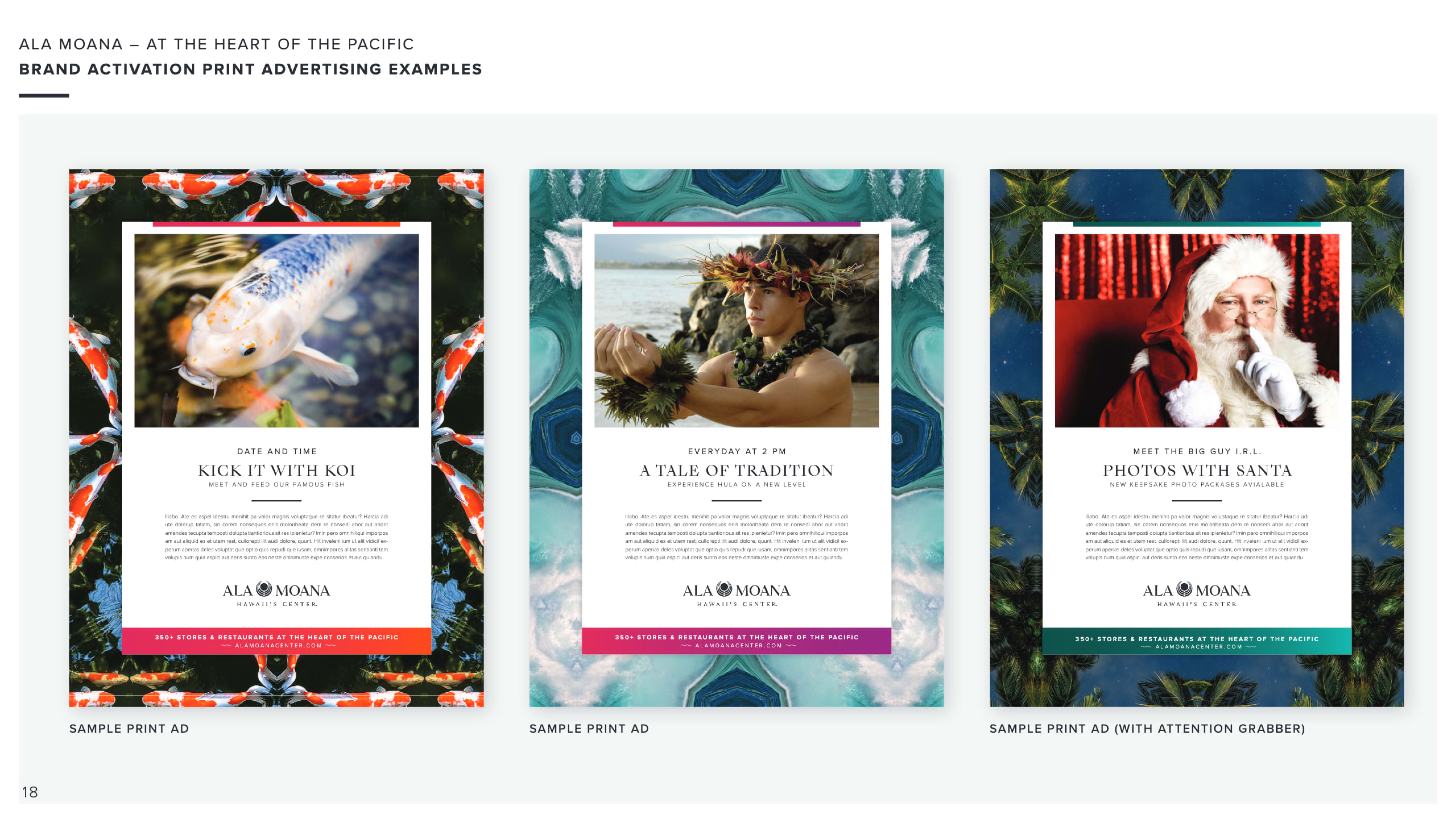
Print advertising + OOH billboard + brand activation event poster executions
The official Ala Moana Center retail directory served the leasing team as both a functional wayfinding tool and a brand touchpoint — a five-level, full-color architectural floor plan mapping 350+ tenants across the world's largest open-air mall. Each level carries a distinct brand color, turning the palette into an intuitive navigation system.
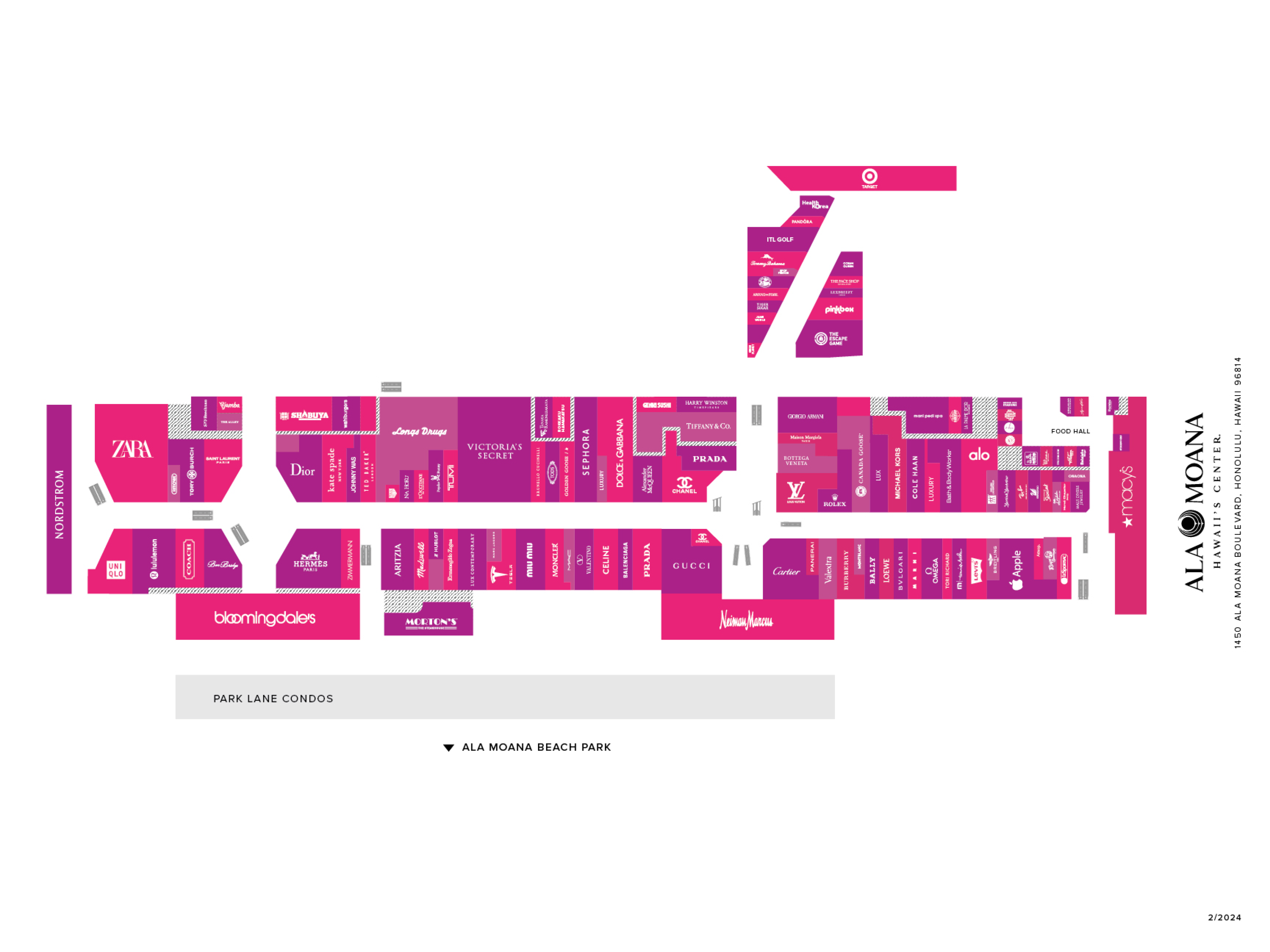
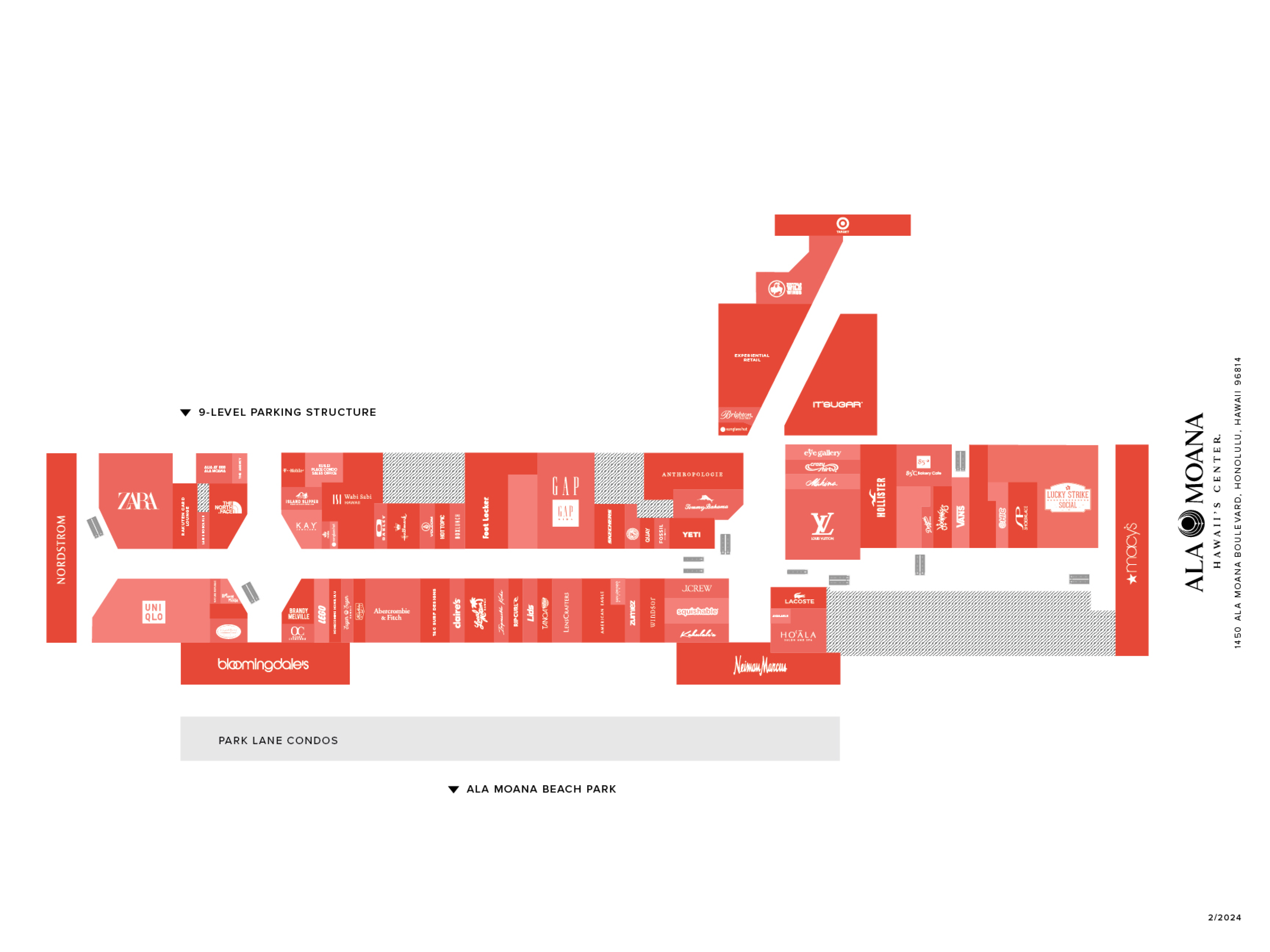
Every retail, dining, and experiential tenant illustrated and placed across five levels of the mall directory.
The brand system serves one of the world's highest-traffic retail destinations — 52 million shopper visits per year.
The brand was designed to resonate across Western and Asian cultural contexts — a genuinely rare creative challenge.
The 2021 brand system continues to define Ala Moana's visual identity across all digital and physical touchpoints today.